Visual Style
Process Street is clean, confident, and intentionally simple. Simple by design. Clear by choice.
Design Principles
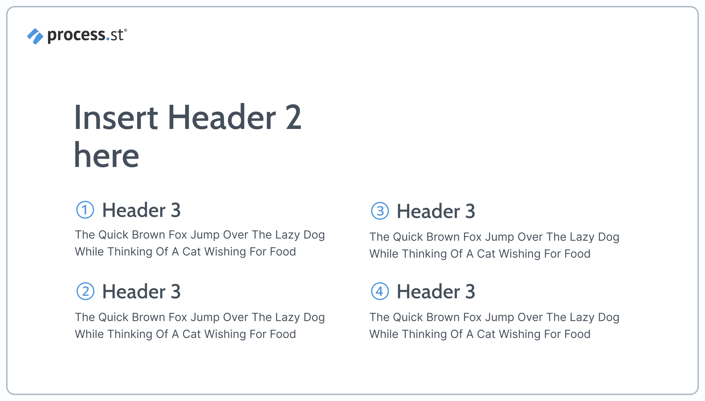
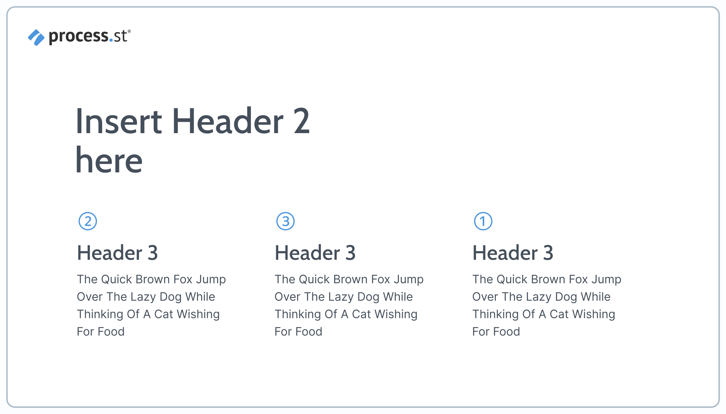
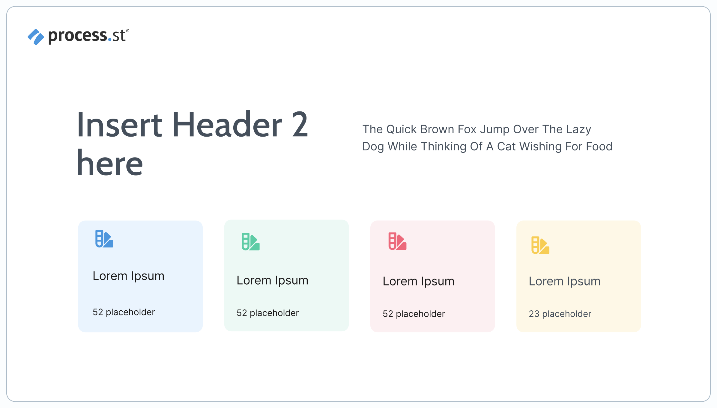
White Space
White space is not empty space—it's a design choice that gives content room to breathe and signals quality. We favor large, uncluttered layouts where every element earns its place.
Typography
Typography does the heavy lifting. Use bold, short headlines and restrained body text. Let the words speak without decoration.
Color
Our color palette creates energy and hierarchy while keeping designs grounded. White backgrounds dominate; brand colors accent.
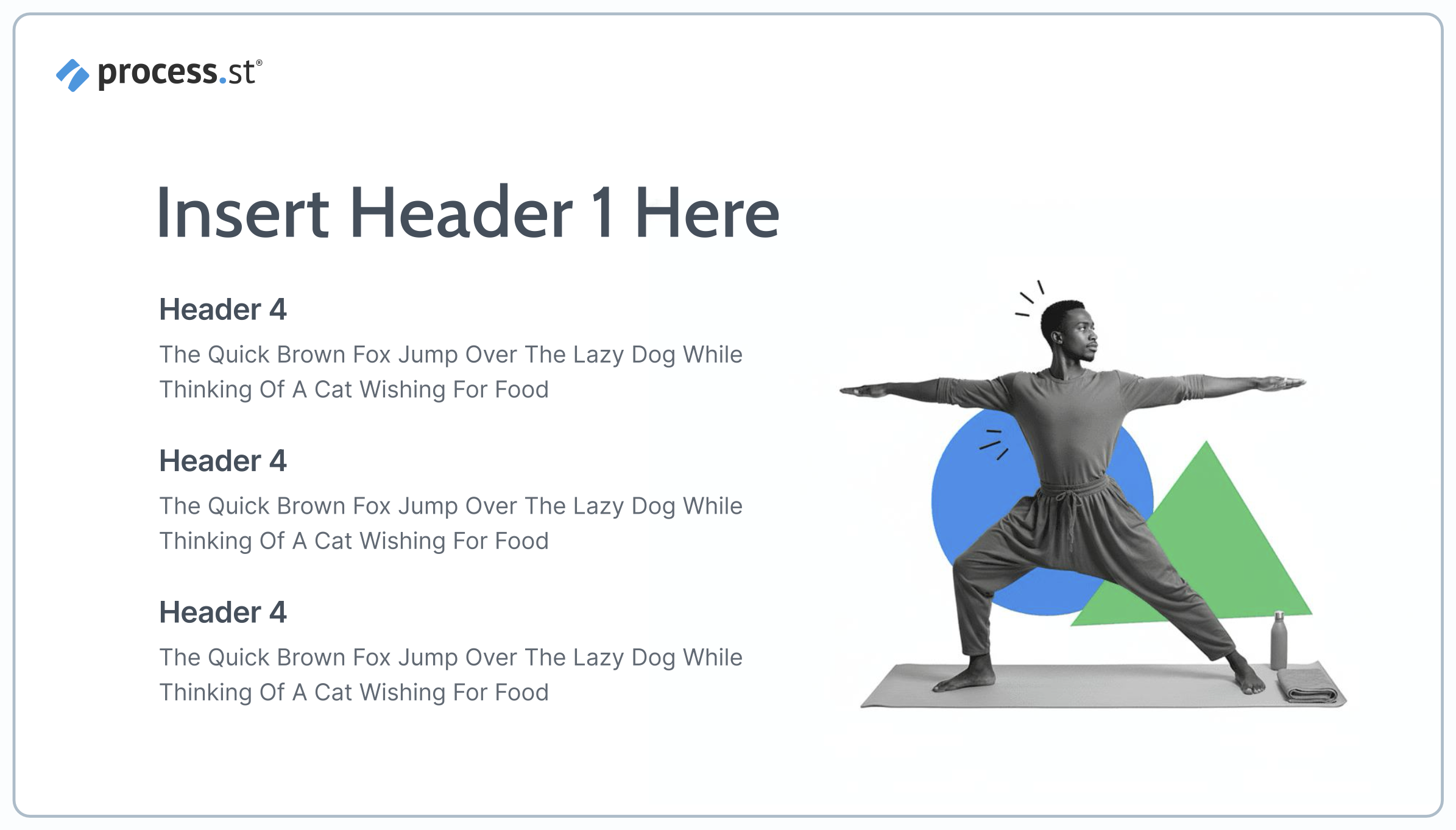
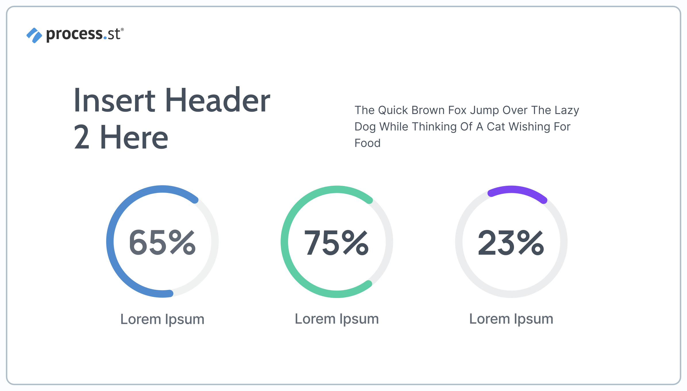
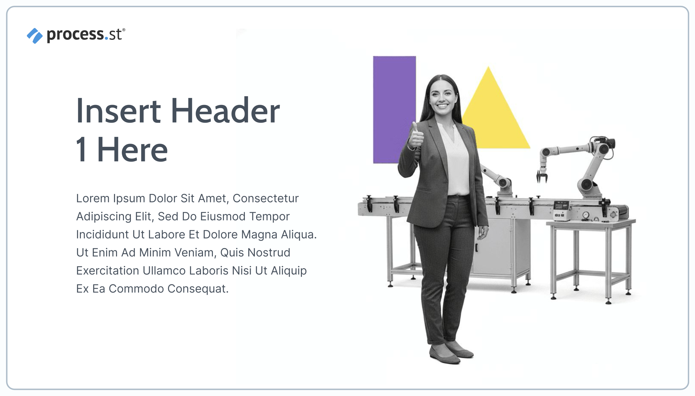
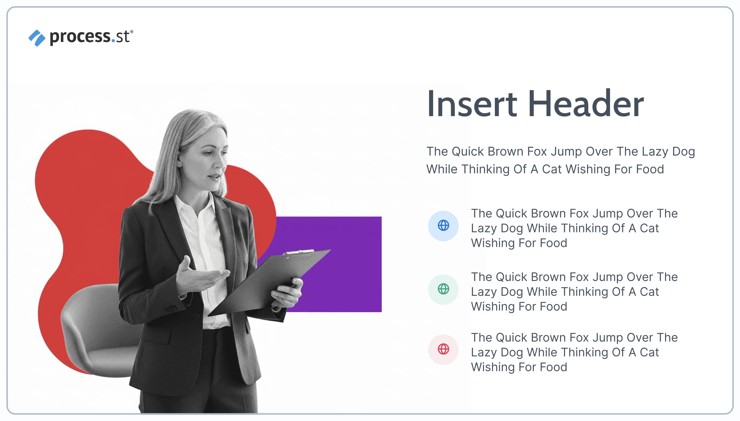
Imagery
Product images and screenshots float on white without borders or drop shadows. People appear in grayscale with 1-2 geometric shapes in brand colors.
Simplicity
We avoid decorative elements, busy patterns, and anything that feels cluttered. Every element must earn its place in the design.
Confidence
Draw inspiration from brands like Apple that let simplicity speak for itself. The overall impression should be calm, confident, and premium.
Quick Reference
✓ Do
- Use generous white space
- Keep headlines short and bold
- Ground designs in white backgrounds
- Float images without frames or shadows
- Use grayscale people + color shapes
- Let simplicity signal quality
✗ Don't
- Fill every available space
- Use decorative elements or flourishes
- Add busy patterns or textures
- Apply drop shadows or borders to images
- Use colored backgrounds heavily
- Let designs feel cluttered
If a design feels busy, remove elements until it doesn't.
Logo
When using the Process Street logo, always preserve its integrity and legibility. The logo must be surrounded by adequate clear space.
Full Logo • Light Background
Full Logo • Dark Background
Full Logo • Blue Background
Icon Only • Light Background
Icon Only • Dark Background
Icon Only • Blue Background
Name Usage
Logo Usage Guidelines
✓ Do
- Use adequate clear space around the logo
- Use the full logo whenever possible
- Maintain sufficient contrast for visibility
- Apply consistently across all materials
- Keep logo at minimum 75px wide
✗ Don't
- Rotate or skew the logo
- Change the logo colors
- Stretch or compress the logo
- Use low resolution versions
- Crowd the logo with other elements
- Use on low contrast backgrounds
Color System
The Process Street color palette ensures visual consistency and clear hierarchy across all brand materials. Click any color to copy its hex code.
Primary Palette
Neutral Grays
Tints & Shades
Blue
Green
Red
Yellow
Purple
Orange
Typography
Two typefaces, two purposes. Cabin brings bold personality to marketing headlines and landing pages. Inter provides the clarity users need in our product UI and documentation.
Cabin
Headers and key statements
Cabin Bold
ABCDEFGHIJKLMNOPQRSTUVWXYZ
abcdefghijklmnopqrstuvwxyz
1234567890!@#$%^&*()
Cabin Regular
ABCDEFGHIJKLMNOPQRSTUVWXYZ
abcdefghijklmnopqrstuvwxyz
1234567890!@#$%^&*()
Type Scale Preview
H1: Streamline Your Workflows
H2: Build Better Processes
H3: Team Collaboration
Inter
Subheaders and body text
Inter Bold
ABCDEFGHIJKLMNOPQRSTUVWXYZ
abcdefghijklmnopqrstuvwxyz
1234567890!@#$%^&*()
Inter Regular
ABCDEFGHIJKLMNOPQRSTUVWXYZ
abcdefghijklmnopqrstuvwxyz
1234567890!@#$%^&*()
Type Scale Preview
Subheader: Process management made simple
Body: Process Street helps teams document, track, and optimize their recurring workflows. Build structured checklists that ensure consistency and accountability across your organization.
Caption: Updated December 2025
Tone of Voice
The Process Street brand voice is clear, confident, and practical. We communicate with purpose, focusing on helping teams work better without unnecessary complexity.
← Too Casual
"Hey! 👋 Wanna make your workflows super awesome? We've got you covered!"
✓ Just Right
"Streamline your team's workflows with structured processes that drive results."
→ Too Formal
"Pursuant to optimizing operational efficiency, our platform facilitates systematic workflow management protocols."
Voice Principles
Clear
We prioritize clarity over cleverness. Our language is straightforward, easy to scan, and free from unnecessary jargon.
Practical
We focus on real-world use cases and actionable guidance. Every message should feel useful and grounded in how teams actually work.
Confident
We communicate with assurance and intention. Our tone reflects expertise without sounding arrogant or exclusive.
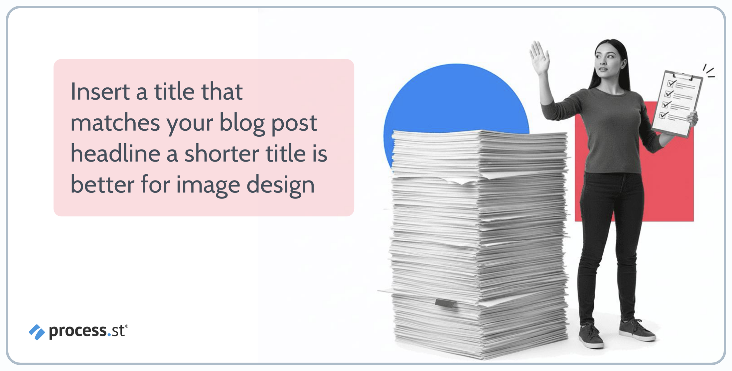
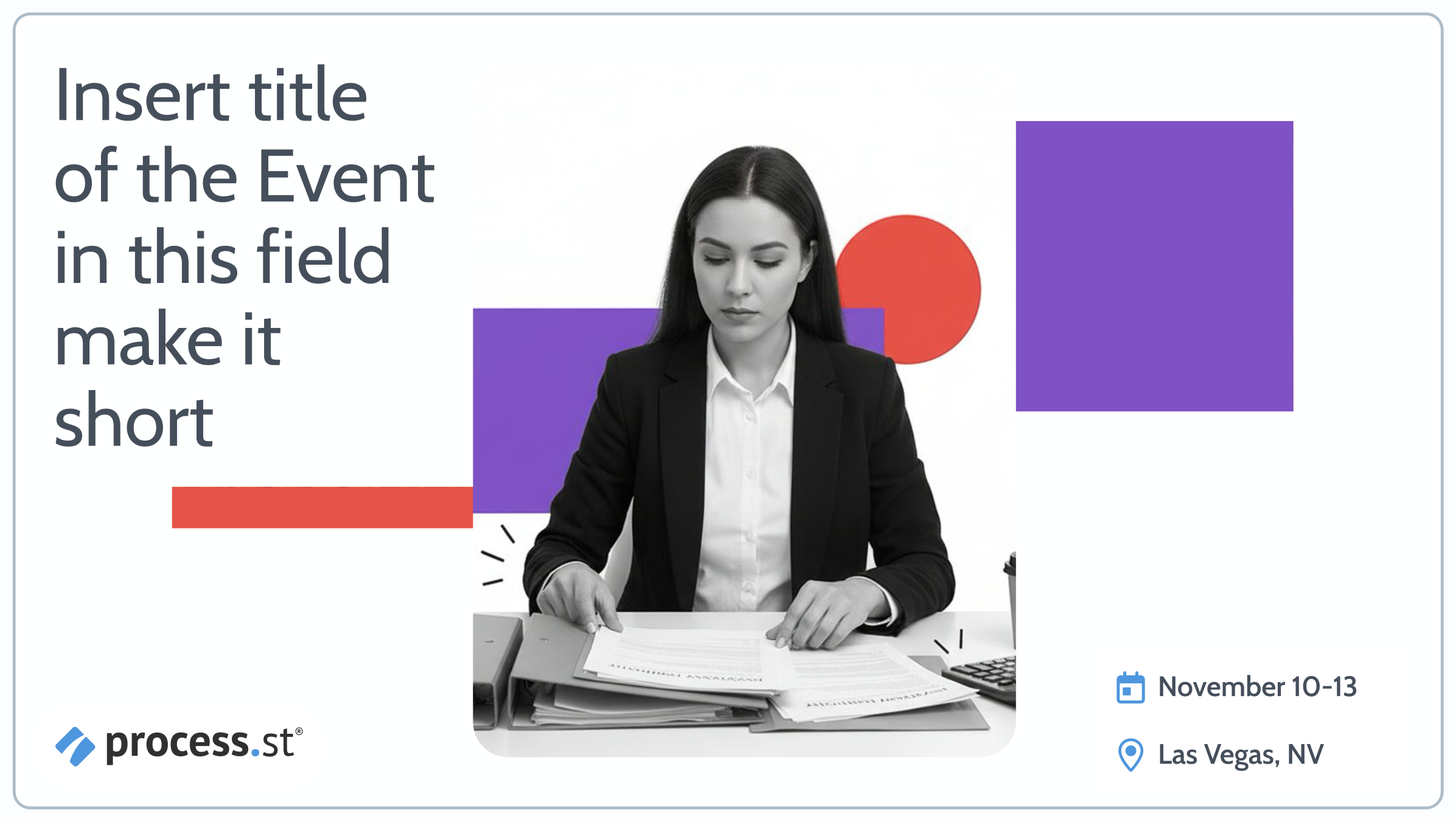
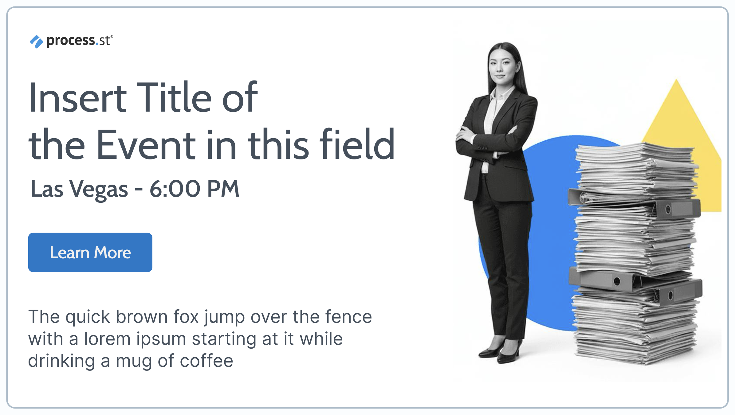
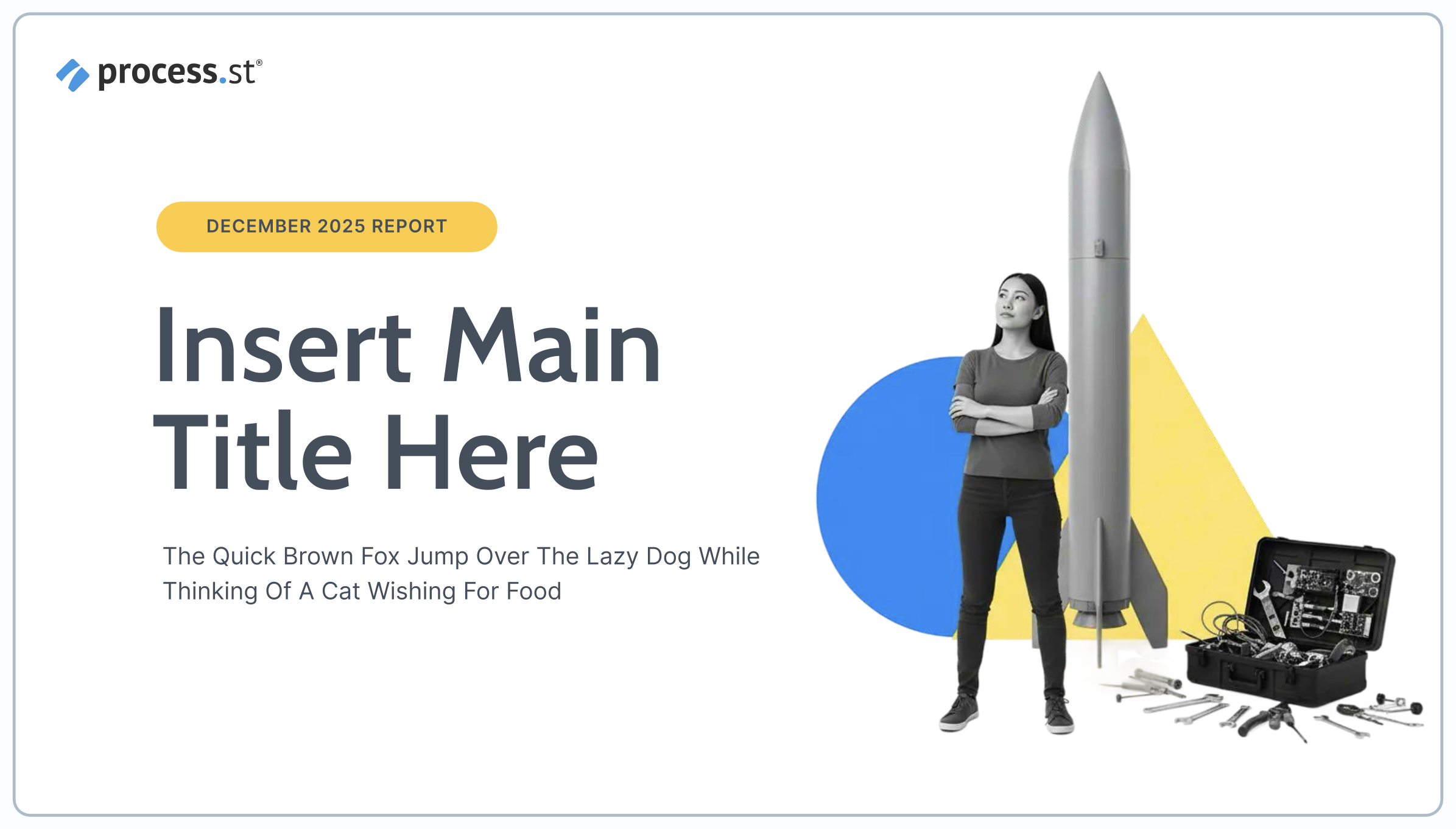
Image Guidelines
Our imagery combines grayscale people with vibrant geometric accents, creating a minimal, modern aesthetic that is unmistakably ours.
Examples


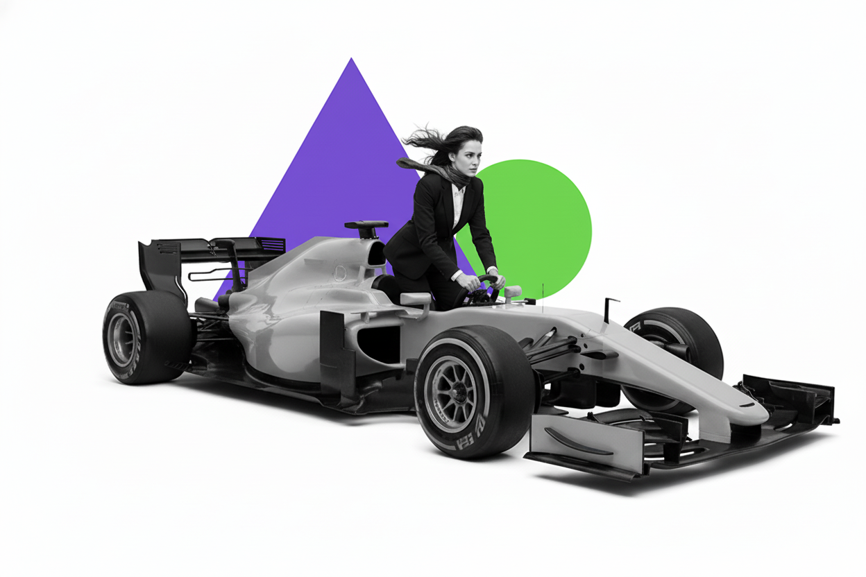

✓ Requirements
- People must be in black and white, fully visible
- Use white backgrounds only
- Limit to no more than 2 shapes and 2 colors
- Review each generated image before use
- Keep images clean and minimal
✗ Restrictions
- No text, labels, warnings, or annotations
- No cartoon-style elements
- No icons, UI elements, or graphic overlays
- No cropped or partially cut-off subjects
- No photographic or environmental backgrounds
Common Rejection Reasons
Contains Text
No labels or annotations
Extra Graphics
No UI or symbols
Photo Background
White only
Cropped Subject
Must be fully visible
Create On-Brand Images
Use our AI-powered Image Generator to create professional, brand-compliant visuals in seconds.
Template Gallery
Browse approved design examples that follow our brand guidelines.